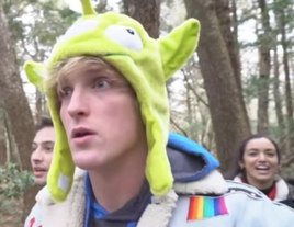
 Logan Paul. If you haven’t heard this name, congratulations. You have spared yourself a lifetime of annoyance. Sorry to ruin that by writing about him now. If you couldn’t tell, I do not like Logan Paul. I could rant about all the reasons why, but instead I will just tell you to read this post with that information in mind. I am going to try and write this with as little bias as possible, but it will most likely sneak through. The Incident Logan Paul is a YouTuber whose vlog channel has amassed over 18.5 million subscribers. He posts staged skits and uses, like many other YouTuber’s, clickbait to garner views and make money via advertisements and sponsors. He has been involved in several controversies but one in particular cemented him in the public shaming hall of fame. In the last hours of 2017, Paul posted a new video entitled “We found a dead body in the Japanese Suicide Forest…” to his channel. To my understanding (I did not and will not watch it), the video shows Paul and his other YouTube friends walking in Aokigahara, or “The Suicide Forest”, in Japan when they come across the body of a man who had apparently committed suicide. He films the body, which was blurred out before being posted online, and says that “This was supposed to be a fun vlog.” After the backlash starts to roll in, Paul deletes the video and issues two apology videos. This article gives more information. Divisive Reaction The purpose of my post is not to debate the morality of his decision to film and post video of a dead body. Although for the record, I think it was horrific. I want to look the divisive response to the video and how this could have been avoided. At first, the response to the video was overwhelmingly negative. Every social media platform was inundated with negative reactions, calls for an apology, pleas for YouTube to ban his content, and even threats. However, not too long after the virtual riot against Logan Paul began, his fanbase, made up of an overwhelming number of young girls, came to his defense. They tried to defend his actions and started online fights with anyone speaking out against him. This incident not only caused a breakdown of communication between Paul and the audience, but also within the audience itself. Audience and Context The intended audience for the original video was subscribers of Logan Paul’s channel, but the controversial nature of the video resulted in a much larger audience and therefore, a much larger backlash. Some people who reacted negatively were predisposed to do so because they already had a negative opinion about Paul from his other videos. For example, in the days leading up to the video of the dead body, he posted other videos of his adventures in Japan. His attitude and behavior in those videos were regarded as disrespectful to Japanese people, culture, and tradition. Put in this context, it is not surprising that people were quick to criticize him on social media. So You’ve Been Publicly Shamed This reminds me of Lindsey Stone’s story in So You’ve Been Publicly Shamed. Lindsey, like Logan Paul, posted what she thought was funny content, but not everyone shared her idea of humor. I don’t think that her controversial photo from the Arlington cemetery can be equally compared to Paul’s video, but I think both of them were caught off guard by the public shaming that came as a result of their actions because they didn’t see anything wrong with what they shared. Restoring Communication Communication suffered a clear breakdown in this situation. Despite his several apologies, many people were not willing to forgive him. I think time is the only way to restore communication after such a disastrous event. The brunt of the public shaming is over, and people have moved on to the next unfortunate soul. However, this is not something that will quickly be forgotten, especially with the permanency of the internet. Personally, I don’t think that there is any amount of apologizing that can fix what he did. If he really wanted to share the experience, he could have done it in a different and less graphic way with the purpose of raising awareness about mental health and suicide. Instead, he posted the video to his channel that is classified under the comedy genre, which conveyed the wrong message about his purpose of posting the video. Public shaming is different depending on who you are. Logan Paul is a B-list celebrity that makes millions off of social media, while Lindsey Stone is still a fairly unknown name, even after the viral photo. Although he was shamed by a much larger group, Paul’s suffering only lasted a couple months before he was back making videos (and money). Lindsey’s shaming was at a smaller scale, but its been years and she still worries about her job and reputation. To give some perspective: When you google ‘Lindesy Stone’ every result on the first page has to do with her photo. When you google ‘Logan Paul’? Not even one of the results on the first page is about his video of a dead body. All is not fair in the internet and public shaming. 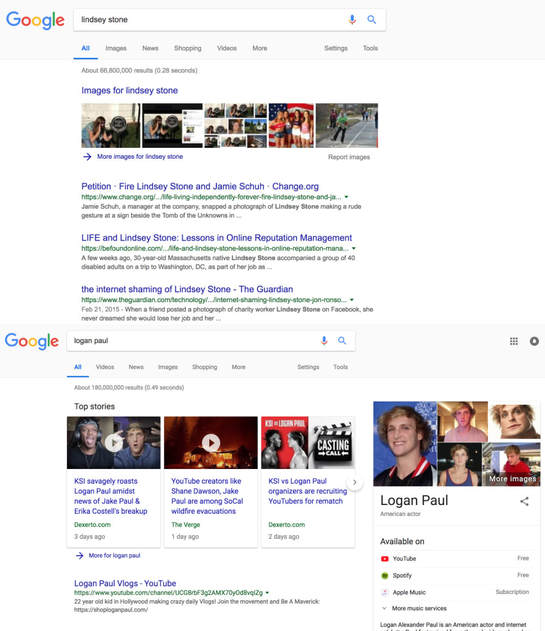 When approaching the design for the Hamlet performance logo I wanted to accomplish a couple things. I wanted to include an image or motif that was recognizably Hamlet. I went back and forth between a couple of ideas, but ultimately, I decided to go with the iconic skull. This is a symbol that most people, whether they are avid readers of Shakespeare or not, know and associate with Hamlet.
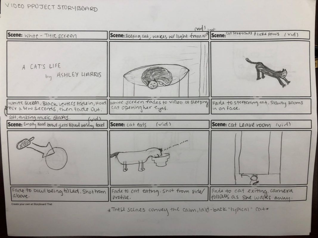
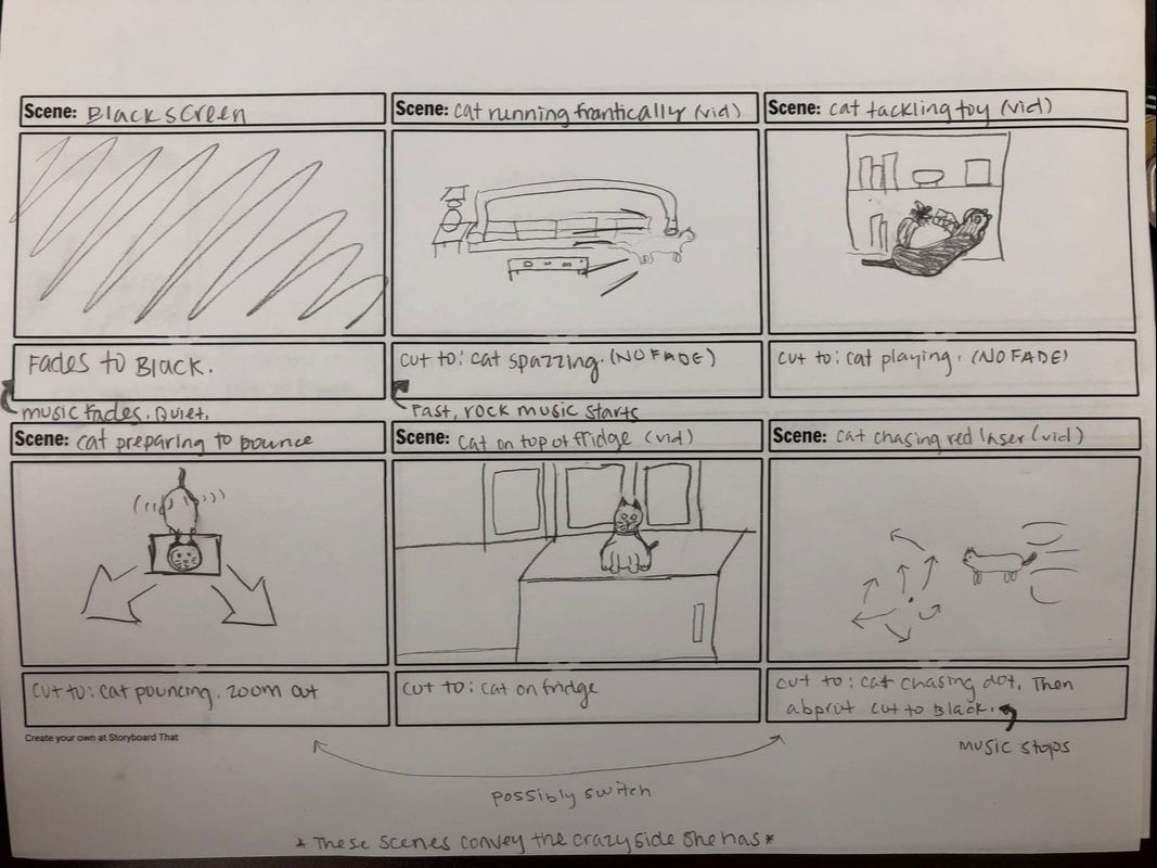
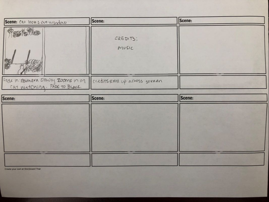
I also wanted the logo to have a deeper meaning and message that an audience could unpack. I accomplished this by using a fairly simple vector design of a skull in profile. I used two of them and aligned them slightly offset so that you could see the different colors. This represents the two versions of Hamlet that we see struggling throughout the play. We have the sane Hamlet who is contrasted with the “mad” Hamlet. This contrast is represented through the different colors; A more vibrant and intense red symbolizes the Hamlet that is driven mad while the gray one underneath symbolizes his slowly waning sanity. Lastly, I made the creative decision to make the logo a simpler design. I organized it so that the emphasis was on the title. I used the sans-serif font Europa in bold to emphasize and make it easy to read. Aligning the skulls behind the letters let the title shine without being boring. For the site mockup, I used dark blue, red, and white as the main color palette. I chose these colors because I think they fit the mood of the play. Dark blue evokes a feeling of nighttime and the potential for supernatural occurrences. Red is a color associated with madness, murder, and conflict which Hamlet is full of. White is a neutral color that provides contrast against the darker colors making words easy to read and giving them more emphasis. For the actors’ page (using the Kenneth Branagh movie version as stand-ins), I used alignment and proximity to make it feel modern but not cramped. I think a modern design would be fitting for this particular performance of Hamlet since the production was done in a more modernized style. I used a typical left justification for the text as well as a different fonts and weights to differentiate between the subtitle (actor name and role) and the short biography of each person. I also used photos of the actors from the movie to help the audience envision the cast as the characters they played. Since we won’t be able to have video of the Nashville performance, I think we should use photos of it to help the reader connect and understand this particular interpretation better. The Cat Life from Ashley Harris on Vimeo.
My introductory website was created using the BBEdit software. I decided that I wanted to challenge myself for this assignment, so I did not use any template. I started my html code the same way we learned to during the tutorial and researched techniques from there. I ended up relying a lot on the W3 Schools website and Youtube for explanation and guidance. My final product is the result of trial and error, as well as some compromise when certain features did not pan out the way I hoped.
I ran into the most technical difficulties with my “Photo Album” page. I tried several methods for layout of the photos and their captions, but because some were portrait and others landscape oriented, it was hard to find a visually satisfying solution. There were a couple of instances where an element wouldn’t work or appear on the webpage, and I couldn’t figure out why. Eventually, I would take a break and as soon as I came back, I figured it out. I realized that, personally, coding is not something I can do for long periods of time; If I don’t take a break, I get sloppy and miss a small, but important, detail. My vision for this website is somewhat similar to what I created. I tried to be realistic and “aim low” since I had never coded before, but I was pleasantly surprised by what I was able to accomplish. I envisioned a more modern and sophisticated website. I wish there were more options for fonts that would work on any device or computer; I think different fonts would have portrayed more of my original vision. The “Photo Album” was originally going to be in a gallery format with uniform squares in rows of three, but that didn’t work for the images I had. I think the photo page is what is farthest from my intended design, so if I were more advanced in coding I would try to reformat that page to be more appealing. I would try and find a better layout for the photos and make captions that appeared if you hovered over a specific image. I used several modes in the creation of my website. I used the linguistic mode throughout the site in headings, titles, captions, paragraphs, and buttons. This serves the majority of the community and is the most common way internet users interact with websites; This makes navigation of my site easy to understand since it is similar to others. I use the visual mode with the use of color, layout, and most of all photos. I tried to emphasize photos so that readers had something interesting to look at and got to know me better. The use of spatial mode will help users navigate my website quickly and easily. Gestural mode is not used other than in the photos. Aural mode is not used at all. If I had more time and skill I would try to implement the latter two modes more. I used color and font size to convey emphasis throughout my website. My hope is that this will allow readers to locate titles and information quickly. Contrast can be seen in the use of a white background and color text and photos this allows emphasis and an ease of reading text. This also ties into color. I chose fun, bright colors to try and convey a certain feeling of joy to my audience. As far as alignment goes, I decided on a centered alignment to give the pages a symmetry and balance. Altogether, I think my introductory website conveys a large part of my personality to readers, and is informative of who I am. 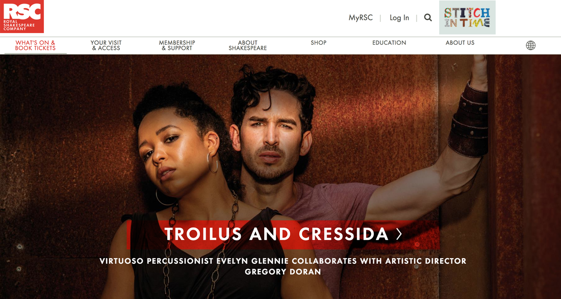 I chose to analyze the Royal Shakespeare Company’s website for this assignment. I chose this site in particular mostly because I had the unique opportunity to see a performance from the Royal Shakespeare Company in Stratford-Upon-Avon in the Summer of 2017. My overall first impression of the site is that I found it visually appealing and fairly easy to navigate. The primary intended audience is tourists, patrons, and members of RSC. The secondary audience could be students and teachers since they have a lot of resources on the website that is geared towards this demographic. I think all of these audience members will have some interest in theater, specifically Shakespeare. They probably place a high value on art and artistic expression in general. The primary purposes for the website are to promote theater and the performances that the RSC puts on, and to inform visitors about what plays are being performed at specific time. Secondary purposes could be gaining donors and members, as well as providing education resources. I make these conclusions because the landing page immediately displays a large, eye-catching photo that promotes the latest RSC performance Troilus and Cressida. As you scroll down the page you see more photos and text listing the other shows for the season. At the top of the page there is a navigation bar that gives visitors a good idea of what information they can find on the website, including ‘Membership’ and ‘Education’. This is published in an online format that is easy for people to find. Although it is a UK web address, most anyone can access it and see what is new for RSC. Before the age of the internet, theater used to be an event in which audiences had to be at the theater in the seats in order to see a play, but using an online platform means that RSC can shares their performances, news, and updates with all of their patrons and donors around the world. Readers can view this on their phone, tablet, laptop, desktop, and most other devices. The design is very appealing to me and conveys what feels like the personality of the Royal Shakespeare Company. They use the color red consistently to convey an edginess that is also present in their adaptations of various Shakespeare plays. It feels somewhat dramatic and modern which are two words that I would also use to describe RSC itself. The use of red places emphasis on the text, specifically the name of the plays. The organization of the photos creates emphasis on the larger photo at the top of the page because that is the next play that will be performed. This contrasts with the smaller photos further down the page that will not be available several weeks. Contrast is also used on the main page where the “News, Blogs and Updates” entries switch between gray and white. I think one thing the Shakespeare in Nashville Archive should include is an emphasis on visuals (photos and video) and a consistent color that can be used throughout the website to add continuity and character.  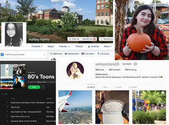 Everyone has a unique personality. When you walk into someone’s bedroom you can often begin to glean some information about who that person is, what they like, and what they care about. The band poster on their wall tells you about their music taste. Do they have a shelf full of books? Or a wide array of movies? These small observations can tell you a lot. Similarly, a person’s online presence can also tell you a lot about them too. A person’s online activity curates a so-called tapestry or a roadmap of their lives, their interests, and so much more.
Sometimes an individual’s “digital curation” is something they consciously aware of, something they are doing purposefully. Other times, it is an unconscious creation. When someone simply pursues content that they find interesting or good, they are not necessarily pursing it with the intention on curation. For me, it is a mix of both conscious and unconscious. In some online forums, like Spotify, I consciously curate a playlist of music that I enjoy and that I feel represents me. For example, I particularly enjoy 80’s and rock music; If someone wanted to know what kind of music I liked, they could easily go to my Spotify playlists and find this out. On other platforms, like Facebook, I am less conscious of the digital presence I am creating. I typically share videos, photos, and any other post that I find interesting, funny, or simply worth sharing. In the long run, this inadvertently creates patterns that others probably use in order to make assumptions about who I am and what I care about. I share a lot of animal videos. I also share a lot of liberal-leaning posts about the state of our government and other various social issues. These things, combined with many others, will create an unintentional portrait of who I am. The fascinating thing is that I do consciously make a decision about language on my social media. On Facebook and Instagram, I make a concerted effort to avoid posts with profane language. I do this because those are the two platforms on which I am “friends” with family members, coworkers, respected family friends, and others who I feel uncomfortable using such language around. However, on Twitter and Snapchat, I tend to have less of a filter because my audience is different. While I am not one to purposefully curate an “aesthetic” or personality on social media, I am someone who is aware of my changing audience from platform to platform. Twitter tends to be the place where I share my own opinion and ideas instead of just sharing someone else’s post like I often do on Facebook. Personally, Instagram is the place I consider myself most conscious of digital curation. I love photography and Instagram gives me a platform on which I can display my “professional” work as well as my personal photos. I think of it as an online photo album. My grandparents had tons of physical photo albums and they would pick out the best pictures to put in; I do the same with Instagram. I strive to make a page that people enjoy looking at but that also serves to represent me. I hope that I can be more conscious in the future about how my digital curation affects my perceived online presence. With employers using social media to recruit and monitor employees, I think it would be a wise choice to be careful about how we may unintentionally present ourselves online; It could be a great advantage or a terrible downfall. |
AuthorAshley Harris is currently a Junior at Belmont University. She is majoring in Publishing with a minor in English Writing. She hopes to end up working at a publishing house in NYC, publishing books for children and young adults. She has an affinity for the Christmas/ Archives
November 2018
Categories |
||||
 RSS Feed
