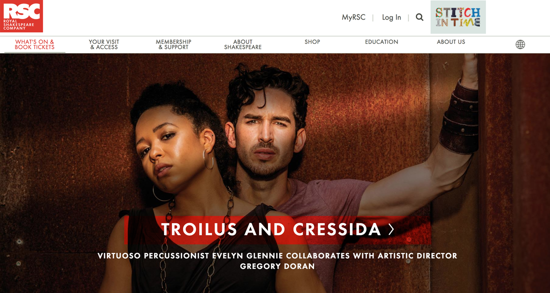
 I chose to analyze the Royal Shakespeare Company’s website for this assignment. I chose this site in particular mostly because I had the unique opportunity to see a performance from the Royal Shakespeare Company in Stratford-Upon-Avon in the Summer of 2017. My overall first impression of the site is that I found it visually appealing and fairly easy to navigate. The primary intended audience is tourists, patrons, and members of RSC. The secondary audience could be students and teachers since they have a lot of resources on the website that is geared towards this demographic. I think all of these audience members will have some interest in theater, specifically Shakespeare. They probably place a high value on art and artistic expression in general. The primary purposes for the website are to promote theater and the performances that the RSC puts on, and to inform visitors about what plays are being performed at specific time. Secondary purposes could be gaining donors and members, as well as providing education resources. I make these conclusions because the landing page immediately displays a large, eye-catching photo that promotes the latest RSC performance Troilus and Cressida. As you scroll down the page you see more photos and text listing the other shows for the season. At the top of the page there is a navigation bar that gives visitors a good idea of what information they can find on the website, including ‘Membership’ and ‘Education’. This is published in an online format that is easy for people to find. Although it is a UK web address, most anyone can access it and see what is new for RSC. Before the age of the internet, theater used to be an event in which audiences had to be at the theater in the seats in order to see a play, but using an online platform means that RSC can shares their performances, news, and updates with all of their patrons and donors around the world. Readers can view this on their phone, tablet, laptop, desktop, and most other devices. The design is very appealing to me and conveys what feels like the personality of the Royal Shakespeare Company. They use the color red consistently to convey an edginess that is also present in their adaptations of various Shakespeare plays. It feels somewhat dramatic and modern which are two words that I would also use to describe RSC itself. The use of red places emphasis on the text, specifically the name of the plays. The organization of the photos creates emphasis on the larger photo at the top of the page because that is the next play that will be performed. This contrasts with the smaller photos further down the page that will not be available several weeks. Contrast is also used on the main page where the “News, Blogs and Updates” entries switch between gray and white. I think one thing the Shakespeare in Nashville Archive should include is an emphasis on visuals (photos and video) and a consistent color that can be used throughout the website to add continuity and character. 
1 Comment
Emily Comfort
9/16/2018 02:55:45 pm
I really enjoyed reading your analysis of this archive! I almost chose it for my blog as well because it seemed to be easy to navigate and looked similar to what I would want our class archive to look like. I also appreciated that you addressed each of the rhetorical devices we read about. I think it makes breaking down something a bit easier when you have sub-sections. I noticed that you wrote quite a bit about the importance of valuing artistic expression to truly get the most out of this article. I think this is an incredibly important observation, and something our class will have to keep in mind when designing our archive. It needs to be educational and easily accessible as well as artistic in its values. Leave a Reply. |
AuthorAshley Harris is currently a Junior at Belmont University. She is majoring in Publishing with a minor in English Writing. She hopes to end up working at a publishing house in NYC, publishing books for children and young adults. She has an affinity for the Christmas/ Archives
November 2018
Categories |

 RSS Feed
